It’s undeniable: Your brand stands to gain a tremendous amount of exposure by investing in mobile ads.
The proof is in the copious reports substantiating the popularity of mobile media. According to recent research from Zenith, consumers are expected to increase their mobile Internet usage to 930 hours a year by 2021, compared with 800 hours this year. “Media now means comparing prices on the high street, sharing jokes with friends and booking your next holiday, opening up new opportunities for brands to connect with consumers,” said Jonathan Barnard, Head of Forecasting with Zenith.
Mobile has become a major part of consumers’ lives, and thus a major marketing opportunity. Consider the fact that 61% of Gen Z consumers believe watching videos on a phone is “as good as watching TV.” Increasingly, mobile isn’t just consumers’ first choice for media, but the only choice.
Talk about dialing up the pressure on digital marketers. With all of those eyeballs ready and waiting to view your ads, you’ve got to get your creative right. Our research reveals seven ways to produce more interesting, relevant, and effective mobile ads.
Let’s take a look.
Add GIF Animations
Mobile ads are often simple in nature. That doesn’t mean they have to be boring. Whether you pronounce it “gif” or “jif” — we’ll save an argument about the merits of each for another article — GIF animations should be on your radar during the ad design process.
According to GroundTruth data, adding a subtle GIF animation improves Click-Through Rate (CTR) performance by 25%. What’s more, it boosts visitation rates by 44%. Even a simple animation has what it takes to help your ad stand out.
Keep Your File Size and Copy as Light as Possible
Mobile user attention span is short — there’s always the risk of distraction and interruptions from the outside world as consumers commute, stand in line, or simply kill time on their phones — so it’s important that your ads load quickly. All publishers prioritize for their own content to load first and ads are the last item on a page to load, so keep those file sizes small.
Speed is an issue with ad exposure, too. It takes consumers about 400 milliseconds to react to a mobile ad. Is yours equipped to pique their interest? We know that ads with copy that’s 5 words or fewer perform 67% better when it comes to visitation rates. In other words, keep your message short and sweet and let your visuals do the talking.
Add Images
Studies show it only takes 13 milliseconds for our brains to process an image. Neuroscientists at MIT found that subjects were able to see new images “more than 20 times as fast as vision typically absorbs information.”
The visuals you choose will of course depend on the nature of your product and campaign objectives, but one thing’s for sure: Including a human or product image performs 55% higher in visitation rate than not having any image at all.
With this in mind, pick a picture that’s more likely to intrigue your potential customer. The right creative image can mean the difference between an ad that’s overlooked and one that incites a consumer to visit your store.
Always Include a Call to Action
We all know the value of a strong call to action — yet not all mobile ads include this key component. Featuring a CTA with the words “buy now” improves visitation rate performance by 51% over the average, so depending on what you want the user’s next move to be — watch a video, learn more, and so on — you always need to encourage them to take action.
Make Your Location Easy to Find
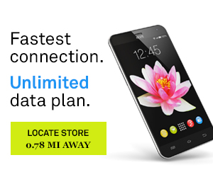
One of mobile advertising’s biggest advantages is its ability to reach consumers while they’re out in the physical world, and leveraging this for marketing purposes is key. Our research shows that including dynamic distance overlay to the nearest store improves visitation rates by 53%.
This makes perfect sense when you consider the convenience of this feature. When a mobile user is mere steps away from a store that offers products relevant to their current wants and needs, they can make a visit without disrupting their day — and you can make it easier for them by providing directions. Create a seamless message by combining the distance overlay with your branded copy. For example: “Dinner is just 1.23 miles away.” Be sure to make the font as large as possible too, as this will make it legible at a glance.
Deploy Ads at Opportune Times
Devising a successful mobile ad campaign isn’t just about what the ad looks like and where it’s placed, but also when it’s received. Our data shows ad engagement is at its highest at 2 pm on Saturdays. Use this type of information to understand the right days and times to run your campaigns, but remember to use logic too; if your goal is to drive visitation for a weekday dinner, it won’t make sense to run your mobile ads on the weekend.
Target Audiences With Personalized Messages
By now most marketers are well aware that personalized ads produce results. Recent research shows 44% of consumers will consider switching to a brand that does a better job of personalizing its marketing communications, and 90% say messages that aren’t personalized are “annoying.”
It’s easy enough to create two different versions of an ad that speak to two different audiences, like these examples targeting millennials and parents. Doing so stands to improve your response rates and create a more appealing ad experience.

The quality and delivery of your ad creative has a huge impact on the effectiveness of your campaign, so use these best practices to your advantage. Not only will you improve your campaign performance, but your audience will appreciate the more engaging and relevant ads.
For more creative mobile ad ideas, contact us today.


